Website page layout mistakes that make people leave early
Avoid website page layout mistakes that make clients leave early. Learn simple fixes for clearer booking paths, trust, and mobile pages.
People usually do not leave a website because they dislike your business. Most of the time, they leave because the page makes them work too hard.
A potential client lands on your site from Google, Instagram, Yelp, or a friend’s text. They are trying to answer simple questions: Do you do what I need? Are you close enough? Can I trust you? How do I book?
If your website page layout hides those answers, the visitor may tap away before they ever see your best work. That is especially rough for local service businesses in Los Angeles, where people compare options fast and often browse from their phone between errands, appointments, and work.
The good news is that most layout problems are fixable. You do not need a flashy site. You need a clear one.
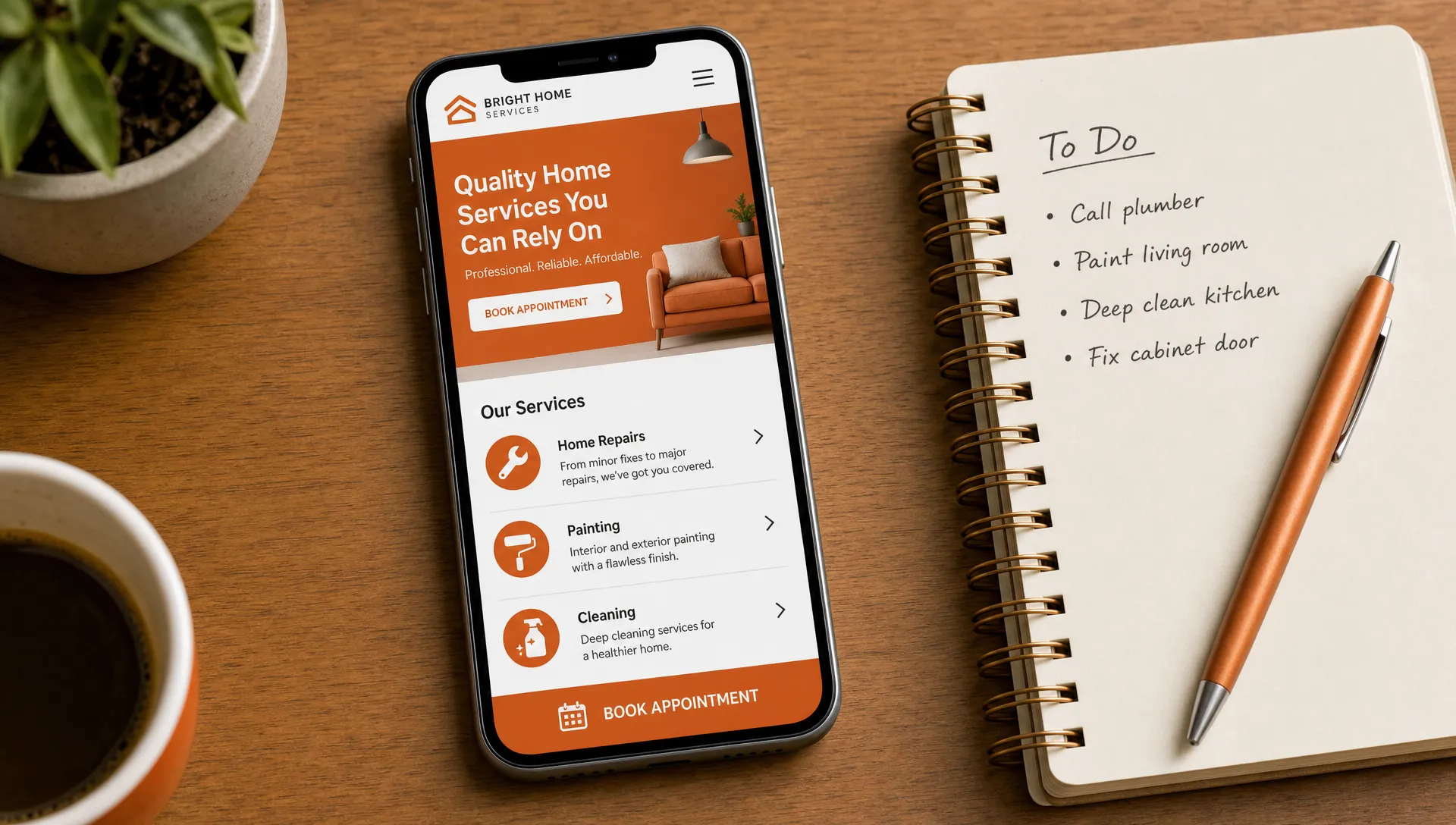
Mistake 1: the top of the page does not explain what you do
The first section of your page has one job: help the right person feel like they are in the right place.
A common mistake is opening with a vague phrase like “Feel your best” or “Beauty reimagined” without saying what the business actually offers. Those phrases might sound nice, but they do not help someone who is looking for a waxer in Echo Park, a lash artist in Sherman Oaks, or a personal trainer near Culver City.
Your top section should quickly show:
- What you do
- Who it is for
- Where you are located or who you serve
- What the next step is
For example, “Gentle waxing and skincare in Silver Lake” is clearer than “Confidence starts here.” You can still sound warm and personal, but clarity should come first.
This matters even more when someone is coming from Google. They may not know you yet. They are trying to decide if your page is worth more than a few seconds of their time.
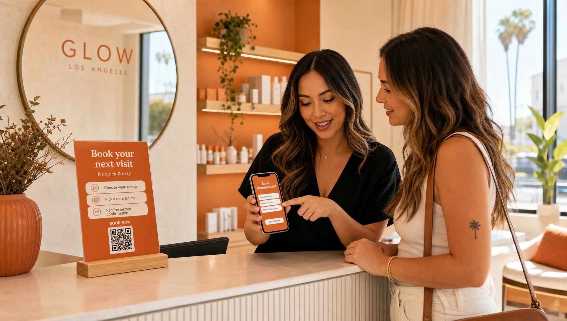
Mistake 2: the booking button is hard to find
If taking bookings is how your business makes money, your booking button should not feel like a scavenger hunt.
A lot of local business websites place one small “Book now” link in the top menu, then never repeat it. On a desktop, that might be okay. On a phone, it can easily get missed, especially if the menu collapses into a tiny icon.
Your booking button should appear in natural places, such as near the top of the page, after your main service section, near reviews, and at the bottom of the page. You do not need to shout at people. You just need to make the next step easy when they are ready.
If you offer several services, make sure the booking path still feels simple. A visitor should not have to guess whether they should book a consultation, choose a service category, call first, or send a message.
For a deeper look at this part of the page, Raine has a separate guide on website page layout tips for clearer paths to booking.
Mistake 3: the page is organized around you instead of the client
It is natural to build a page in the order you think about your business. Your story, your process, your full menu, your policies, your links, your favorite photos.
But visitors are usually thinking about themselves first.
A new client might be wondering, “Can they help with my acne before a wedding?” or “Do they do hard gel fills?” or “Can I train here without feeling judged?” If your page starts with a long founder story before answering those questions, the visitor may leave even if you are a great fit.
A helpful page order often looks like this:
- Clear promise at the top
- Main services or offer
- Why clients choose you
- Photos, reviews, or examples
- Simple booking details
- Location, hours, and policies
- Final booking button
Your story still belongs on the page. It just needs to support the client’s decision, not slow it down.
Mistake 4: the mobile version feels squeezed together
Many small business owners check their website on a laptop because that is where they manage the business. Your clients, though, may be looking from a phone while sitting in their car, walking to lunch, or scrolling at night.
A page can look beautiful on a large screen and still feel frustrating on mobile. The most common mobile layout problems are small text, crowded sections, buttons too close together, huge images that push important information down, and menus that hide the booking link.
Before you worry about anything fancy, open your site on your phone and ask yourself:
Can I understand what this business does without pinching or zooming? Can I find the booking button without hunting? Can I read the service details without getting tired? Does the page load in a way that feels comfortable?
You do not need to be technical to spot these issues. If it feels annoying to you, it probably feels annoying to a potential client too.
Mistake 5: every section asks the visitor to do something different
A website can become messy when every section has a different goal.
One part asks people to book. Another asks them to join a newsletter. Another sends them to Instagram. Another promotes a limited offer. Another asks them to read a blog post. Another asks them to call. None of these things are bad on their own, but too many choices can make the page feel scattered.
For a booking-based business, the main action should usually be booking an appointment, requesting a consult, or sending an inquiry. Everything else should support that action.
This does not mean every button has to say the exact same thing. But the page should have a clear direction. When people feel unsure, they often do nothing.
Here is a simple way to spot the issue:
| Layout mistake | What the visitor may feel | Better approach |
|---|---|---|
| Vague top section | “Am I in the right place?” | Say what you do, where you are, and who you help |
| Hidden booking button | “How do I make an appointment?” | Place booking buttons where decisions happen |
| Too many next steps | “What am I supposed to do?” | Choose one main action for the page |
| Long blocks of text | “I do not have time for this” | Break content into short, clear sections |
| Trust details too low | “Can I rely on this person?” | Show reviews, photos, credentials, or policies earlier |
Mistake 6: trust shows up too late
People need to trust you before they book. That is true for almost every service business, but it is especially true for beauty, wellness, fitness, and personal care.
A client booking a Brazilian wax, facial, lash service, haircut, tattoo appointment, or personal training session is not just buying a product. They are choosing someone they will spend time with in person. They may be thinking about comfort, cleanliness, privacy, skill, and whether they will feel welcome.
If your reviews, photos, credentials, policies, or studio details are buried near the bottom of the page, some visitors may never reach them.
Trust can be built into the layout in small ways:
- Place one strong review near the top of the page
- Show real photos of your space, work, or face when appropriate
- Mention your neighborhood or service area clearly
- Explain what new clients can expect
- Make cancellation, deposit, or arrival details easy to find
Trust does not have to be loud. It just needs to be visible before the visitor starts worrying.
Mistake 7: the service section is too thin or too crowded
Your service section is one of the most important parts of the page. It is also one of the easiest places to lose people.
If the section is too thin, visitors do not get enough information to choose. “Facials, waxing, brows” may be accurate, but it does not explain what makes each service right for them.
If the section is too crowded, visitors feel overwhelmed. A giant menu with every variation, add-on, and price can be hard to scan, especially on mobile.
The better middle ground is to group services clearly and give each one a short description. For example, a skincare studio might group services into facials, waxing, brows, and packages. A trainer might group offers into one-on-one training, small group sessions, and intro assessments.
You can save the full menu for your booking system if needed. On the page itself, focus on helping people choose the right starting point.
If you have one main offer or a seasonal service you want to highlight, a focused page may work better than sending everyone to a full website. This is where service landing page design that makes booking feel easy can be useful.
Mistake 8: the page looks pretty but does not guide the eye
A pretty website can still be hard to use.
This happens when every section has the same visual weight. Every heading is large. Every photo is bold. Every button is the same color. Every paragraph is centered. The page may look full, but the eye does not know where to go.
Good layout creates a path. Important details stand out. Supporting details sit quietly underneath. Buttons are easy to spot. Headings help people skim. Space gives the visitor room to breathe.
Think of your page like your studio or workspace. If someone walks in, you want the flow to make sense. They should know where to check in, where to sit, and what happens next. Your website needs that same feeling.
For inspiration outside the beauty and wellness world, the Arcus Apparel Group homepage gives a clear example of a business leading with what it does, then backing it up with services and proof. The industry is different, but the lesson is the same: visitors should not have to dig to understand the offer.
Mistake 9: important local details are missing
Local clients care about practical details. If they are deciding whether to book, they may need to know where you are, how parking works, what hours you keep, whether you take new clients, and how far in advance they should schedule.
A website page layout that hides these details can create doubt. In Los Angeles, even a few miles can feel like a big decision depending on traffic, parking, and timing.
You do not have to put every logistical detail at the very top. But your location and service area should be easy to find. If your business is appointment-only, say that. If your studio is inside a larger building, explain what to expect. If parking is simple, mention it. If parking is tricky, a short note can prevent stress and late arrivals.
These details may seem small, but they can make booking feel safer and easier.
Mistake 10: the bottom of the page just stops
The bottom of your page is not a throwaway area. If someone reaches the end, they are still engaged. Do not leave them with a dead end.
A weak ending might include a logo, a few social icons, and nothing else. A stronger ending reminds visitors what you offer and gives them a clear next step.
For example, the final section might say, “Ready for your next facial in Silver Lake?” followed by a booking button. Or, “Not sure which service to choose? Send a quick inquiry and I’ll point you in the right direction.”
This is especially helpful for clients who have read the full page but still need a gentle nudge. They should not have to scroll all the way back up to take action.
A simple page layout check you can do today
You do not need to redesign your whole website to make it easier to use. Start with a quick check.
Open your homepage or main booking page on your phone. Pretend you are a new client who found you on Google. Give yourself 30 seconds and ask: Do I know what this business does? Do I know where it is? Do I know who it is for? Do I know how to book?
Then scroll from top to bottom and notice where you feel confused, bored, or unsure. Those moments are clues. They show you where your layout is asking too much from the visitor.
You can also ask a friend who is not in your industry to look at the page. Do not explain anything first. Just ask what they think you offer and what they would do next. If they cannot tell, your layout needs more clarity.
Small changes can help a lot. Move the booking button higher. Shorten the first section. Add a review near the top. Break a long paragraph into smaller pieces. Put your location in plain sight. Make the final section point back to booking.
Frequently asked questions
What is a website page layout? A website page layout is the way the sections, text, images, buttons, and links are arranged on a page. For a local service business, a good layout helps visitors understand what you offer and how to book without feeling lost.
How do I know if my layout is making people leave early? Look for signs like people asking questions that are already answered on your site, lots of website visits but few bookings, or friends saying they were not sure where to click. You can also test the page on your phone and see how quickly you can find the main details.
Should my booking button be at the top of every page? If bookings are important to your business, it is usually helpful to have a booking button near the top and again in other natural places. The goal is not to pressure people. It is to make booking easy when they are ready.
Do I need a full website or just one booking page? It depends on your business and offer. Some solo pros can start with one strong booking page. Others need a fuller site with service pages, an about page, and more room for details. The right choice depends on how much a client needs to know before booking.
Can I fix layout mistakes without changing my whole brand? Yes. Many layout fixes are about order, clarity, spacing, and wording. You can often keep your colors, photos, and general style while making the page much easier to use.
Want your website to feel easier to book from?
If your site is pretty but people still ask where to book, what you offer, or where you are located, the layout may be getting in the way.
Raine Archer designs warm booking pages, sales pages, and full websites for small businesses, solo pros, salons, and local service providers in Los Angeles. If you want a site that feels clear, welcoming, and easy for clients to use, a thoughtful layout is a good place to start.