Service landing page design that makes booking feel easy
Service landing page design tips for small local businesses that want clearer offers, easier booking, and fewer confused visitors.
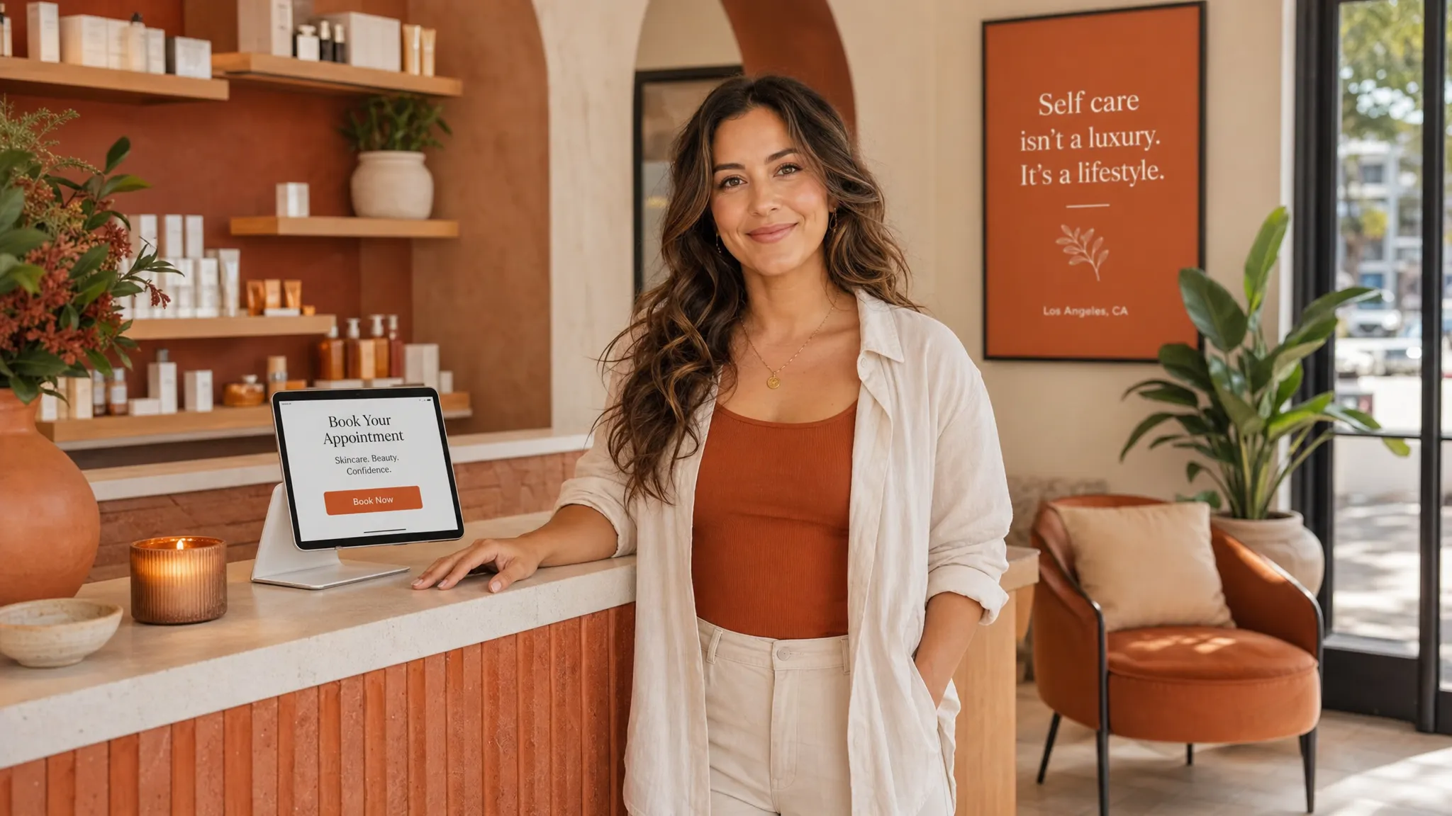
A good service page should feel like a helpful front desk person. It welcomes someone, answers the questions already in their head, and makes the next step feel simple.
For a local business, that next step is usually booking. A new client may be sitting in her car between errands, checking your page after seeing your Instagram. A personal training lead may be comparing gyms from the couch at 10 p.m. A waxing client may be wondering if you are close enough, clean enough, and available before the weekend.
That is where thoughtful service landing page design matters. Not fancy tricks. Not a page packed with everything you have ever done. Just a clear, warm page for one service that helps someone decide, “Yes, this is what I need,” and book without overthinking it.
What a service landing page is
A service landing page is one focused page for one offer or booking goal. It is different from a full website because it does not need to explain your whole business. It is built to help one type of client understand one service and take one next step.
For example, a service landing page could be for:
- A Brazilian wax for first-time clients
- A new client facial special
- Lash extensions for brides
- A 6-week personal training starter package
- A private nail art appointment
- A consultation for permanent jewelry, brows, or skincare
The page can live on your website, or it can be the link you share from Instagram, Google Business Profile, email, or a text to a past client. If you are promoting one service, one seasonal offer, or one way to work with you, a landing page is often easier for visitors than sending them to your homepage and hoping they find the right button.
If you want help creating one polished page for a single offer, Raine Archer’s landing page design in Los Angeles is built for service providers, creators, and small businesses that need a clear place to send people.
Why booking often feels harder than it should
Most people do not leave a service page because they dislike the business. They leave because they are unsure.
They might be wondering if the service is right for them. They might not see the price, the location, the length of the appointment, or what happens after they book. They might be on a phone and the button is too small. They might have to tap through three pages just to find your booking link.
For Los Angeles service businesses, the little details matter even more. A client may care about parking. They may want to know if your studio is in Silver Lake, West Adams, Culver City, or Pasadena because traffic changes everything. They may need to know if you take first-time clients, if your suite is easy to find, or if they should arrive with clean skin, bare nails, or workout clothes.
A strong service landing page removes as many small doubts as possible before the booking button.
Start with the client’s real question
Before you think about colors, photos, or layout, ask one simple question: what does someone need to know before they feel ready to book?
For a waxing studio, it may be: “Will this be comfortable and clean?”
For a skincare studio, it may be: “Will this facial help my skin without making me feel judged?”
For a trainer, it may be: “Can I start from where I am without feeling embarrassed?”
For a nail or lash salon, it may be: “Will the result look like the photos, and how long will it take?”
Your page should answer that question early. The first screen should not be vague. Instead of “Beauty made simple,” try something more specific, like “Gentle first-time Brazilian waxing in Echo Park” or “Private strength training for beginners in West LA.”
Clear does not mean boring. It means your visitor knows they are in the right place.
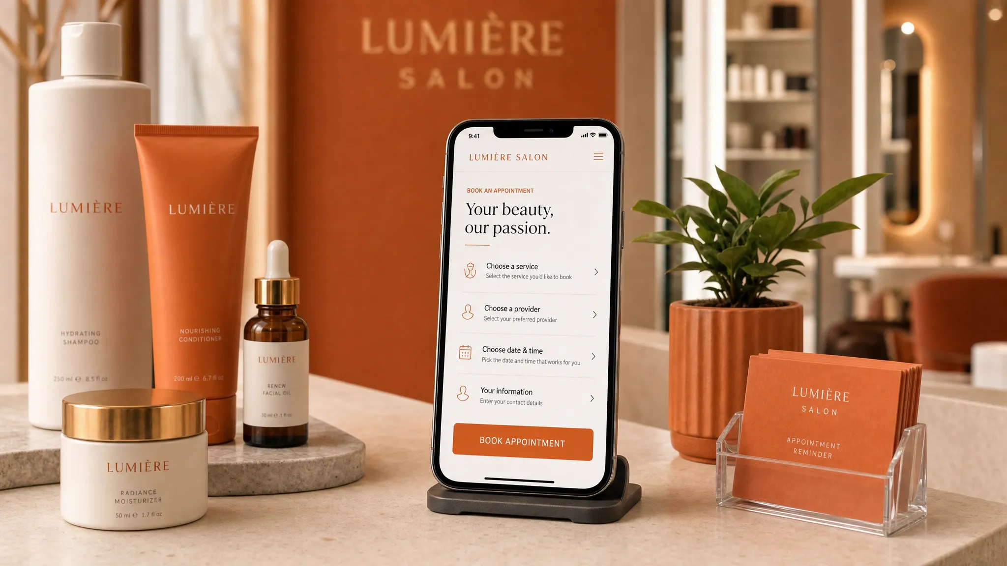
The sections that make booking feel easy
A service landing page does not need dozens of sections. It needs the right information in the right order. Think of it as a short conversation with a new client.
| Page section | What the client is asking | What to include |
|---|---|---|
| First screen | Am I in the right place? | Service name, location or service area, main benefit, booking button |
| Service details | What exactly do I get? | What is included, who it is for, appointment length, starting price if available |
| Trust section | Can I feel safe choosing you? | Reviews, real photos, credentials, years in business, clean studio details |
| What to expect | What happens next? | Before, during, and after the appointment in plain language |
| Booking area | How do I take the next step? | A clear button, booking link, contact option, and any policy notes |
This order works because it follows how people decide. First they want to know if the page is relevant. Then they want details. Then they want reassurance. Then they want a simple way to book.
If you are building a full site instead of a one-page offer, there are more pieces to think through. This guide to what a great service website needs to book more clients is a helpful next read.
Make the first screen do more work
The top of your page is precious. On a phone, it may be all someone sees before deciding whether to keep reading.
A strong first screen usually includes a clear headline, one short supporting sentence, a warm photo or clean visual, and one obvious booking button. If you serve a local area, mention it. If the service is for a specific type of client, say that too.
Here are a few examples:
- “Beginner-friendly personal training in Highland Park”
- “Calm acne facials for sensitive skin in Los Angeles”
- “Soft gel nail appointments in Koreatown with detailed nail art”
- “First-time lash extensions in Studio City with a natural look”
The goal is not to impress everyone. The goal is to help the right person feel seen.
Write the service details like you are explaining them out loud
A lot of service pages sound too formal. They use pretty words but skip the information a real client needs.
For most local services, plain language works better. Explain what is included, how long it takes, who it is best for, and whether there is anything the client should know before booking. If you have a starting price, show it. If pricing varies, explain what affects the price.
You do not have to share every single detail on the page. But hiding the basics can make people hesitate. A client who cannot find the price, location, or appointment length may decide to “come back later,” which often means they never come back.
Good service copy sounds like this: “This 60-minute facial is best for dull, congested, or stressed skin. We will start with a quick skin chat, then choose products based on how your skin looks and feels that day.”
That is warmer and more useful than a long paragraph full of beauty buzzwords.
Design for the phone first
Many local clients will see your page on a phone. They may come from Instagram, Google Maps, a referral text, or a quick search while they are out in the city.
That means your page should be easy to read and tap on a small screen. The booking button should not be tiny. Text should not be crowded. Photos should load cleanly. The most important information should not be buried at the bottom.
Google has also used mobile-first indexing for years, which means the mobile version of your page matters for how Google understands your site. You do not need to know the technical side, but it is a good reminder that your phone layout is not a smaller afterthought. It is often the main version your clients and Google see. You can read Google’s own explanation in its mobile-first indexing guidance.
For a booking page, mobile-first design usually means short sections, clear spacing, simple buttons, and no confusing pop-ups that cover the page.
Put the booking button where people need it
One booking button at the top is good. But for most service landing pages, you will want the booking button to appear more than once.
Place it near the top, after the service details, after trust-building content, and near the bottom. That way, when someone feels ready, they do not have to scroll around looking for the next step.
The button text should match the action. “Book now” is fine, but more specific wording can feel clearer:
- “Book your first wax”
- “Schedule a skin consult”
- “Check facial availability”
- “Reserve a training session”
- “Book a lash appointment”
If your booking tool opens a calendar, say that. If the first step is a form, say that too. People are more likely to continue when they know what will happen after they tap.
Build trust before asking for the booking
Trust is not one section only. It should show up across the page.
For a beauty studio, trust can come from clean, natural photos of the space, reviews from real clients, a short note about your approach, or clear aftercare instructions. For a trainer, it can come from your coaching style, who you work best with, and what a first session feels like. For a local studio, it can also come from practical details like parking, entrance instructions, and neighborhood.
You do not need to overprove yourself. You just need to make the page feel real. Stock photos can work in some cases, but real photos often feel more grounded, especially for local service businesses where clients are deciding whether to visit in person.
A few trust details that help:
- A short review near the booking button
- Photos of the room, chair, table, gym, or studio
- A note about cleanliness, privacy, or comfort when relevant
- Credentials, licenses, or training if they matter for your service
- Clear policies for deposits, cancellations, or late arrivals if you use them
The best trust details are the ones your clients already ask about.
Keep the page focused on one next step
A service landing page can lose its power when it asks people to do too many things.
If the main goal is booking, do not give equal attention to your newsletter, five other services, your entire story, and every social media link. Those things may belong somewhere else on your site. On this page, the main path should be obvious.
That does not mean you cannot mention related services. You can, especially if they help someone choose the right appointment. But the page should still have one main booking goal.
For example, if the page is for new client facials, the main button should not change from “Book a facial” to “Shop products” to “Follow on Instagram” to “Join the email list.” Too many choices can make a page feel busy, and busy pages are harder to use.
Use local details when they help people decide
Los Angeles clients often make booking decisions around logistics. A beautiful page that skips the basics may still lose people.
If your service happens in person, include your neighborhood or service area. If parking is easy, say so. If your studio is inside a larger building, mention that clients receive entrance details after booking. If you are near a recognizable cross street or landmark, that can help too.
You do not need to publish private details if you work from a private studio and prefer to share the exact address after booking. But you can still give enough location context for someone to know if the appointment makes sense for their day.
Local details also help the page feel made for real people, not just search engines.
What to check before you publish
Before you share your service landing page, open it on your phone and pretend you are a brand-new client. Better yet, send it to one trusted friend who has never booked that service with you.
Ask them if they can quickly answer these questions:
- What service is this page for?
- Where is the business located or what area does it serve?
- How much does it cost, or where can they see the price?
- What happens after they tap the booking button?
- Do they feel like they know enough to book?
If they have to hunt for the answers, the page needs more clarity. Small edits can make a big difference.
FAQ
Do I need a full website or just a service landing page? If you only need to promote one service, special, event, or new offer, a service landing page may be enough. If you need pages for several services, an about page, a contact page, and more local search support, a full website may be a better fit.
Should I put prices on my service landing page? If you can share a clear price or starting price, it usually helps people decide faster. If pricing depends on the client, explain why and tell them how to get an accurate quote or consultation.
How many booking buttons should the page have? Most service pages work well with a booking button near the top, one after the main details, and one near the bottom. The key is to make the next step easy without making the page feel pushy.
Can a service landing page help me get found on Google? It can help if the page is clear, useful, mobile-friendly, and connected to your real service and location. For local search, your Google Business Profile, reviews, website content, and consistency across the web also matter.
What if I use a booking tool already? That is fine. Your landing page can explain the service and send ready clients to your booking tool. The page does the welcoming and answering first, then the booking tool handles the appointment.
Make booking feel simple
Your service landing page does not need to be loud or complicated. It needs to help the right person understand your offer, trust you enough to take the next step, and book without confusion.
If your current page feels outdated, hard to use on a phone, or too vague for new clients, Raine Archer can help you create a warmer, clearer page for your service. Start with a landing page designed for local bookings and give your next client an easier path from “I’m interested” to “I booked.”