How to layout websites so visitors know what to do next
Learn how to layout websites so visitors know what to do next, trust your business, and book without getting lost.
If you’ve ever wondered how to layout websites so people stop wandering around, think less like a designer and more like the person answering your front desk phone.
A good website layout quietly answers three questions for every visitor: Am I in the right place? Can this business help me? What should I do next?
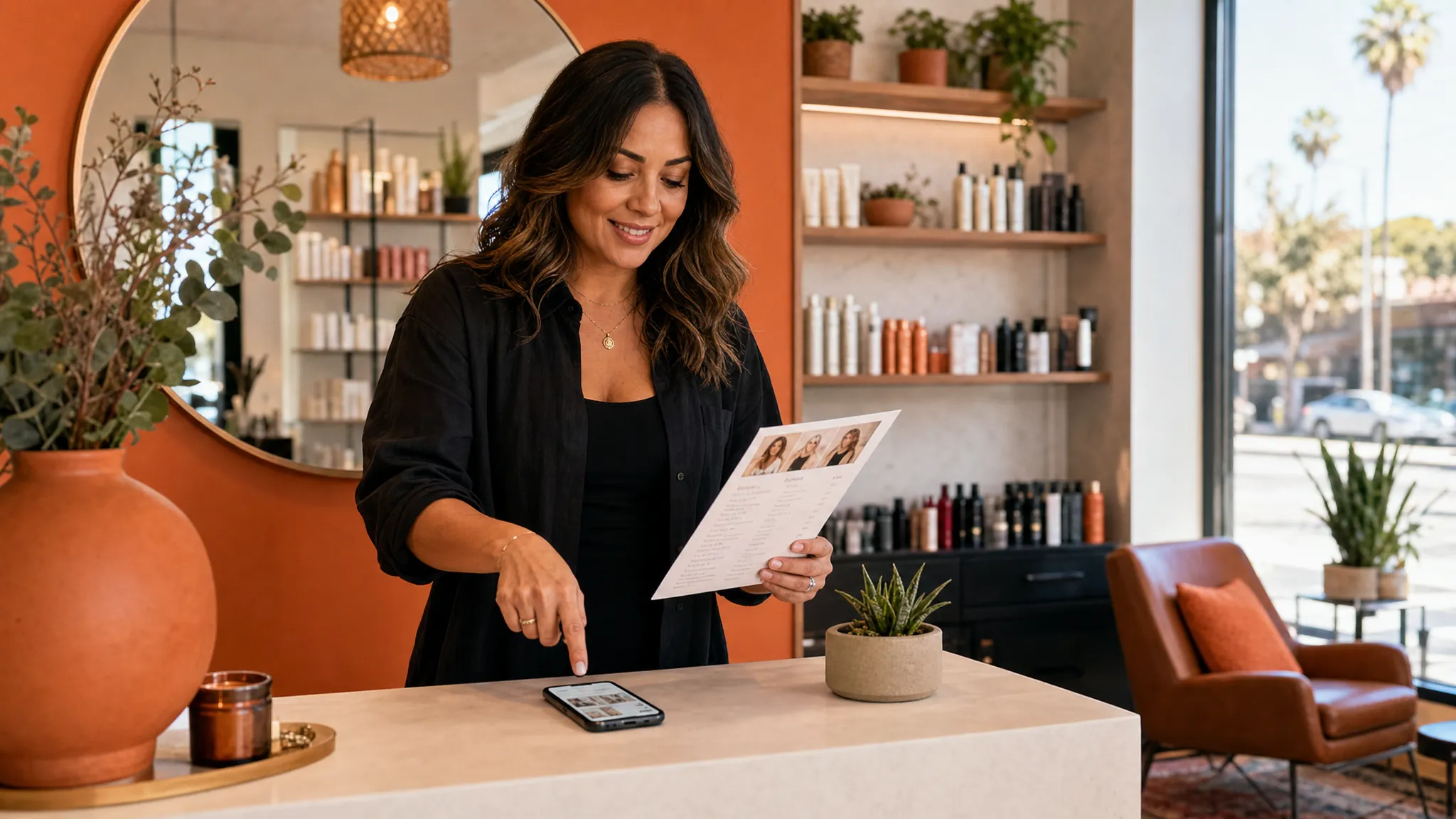
For a Los Angeles salon, skincare studio, gym, personal trainer, or local service business, layout is not about filling every inch of the page. It is about helping a busy person on their phone decide whether to book, call, ask a question, or keep reading.
When your layout is clear, visitors do not have to work hard. They can see what you offer, where you are, whether they trust you, and how to take the next step.
Start with one main next step
Before you move sections around, choose the one action you want a visitor to take on that page.
For a booking page, the main next step is usually booking an appointment. For a service page, it might be viewing available times or sending an inquiry. For a sales page, it might be reserving a spot, buying a service package, or joining a waitlist.
The mistake many small business websites make is asking for too many things at once. Book now. Follow us. Join the email list. Read the blog. Download the guide. Watch the video. Learn our story. Shop products.
All of those may have a place, but they should not all feel equally important. A calm layout gives one path the strongest attention, then lets the other links support it.
A simple rule: if a first-time visitor only remembers one thing from the page, what should it be?
For many local businesses, the answer is this: this is the right service, and booking is easy.
Think of the layout like a client conversation
A useful website layout follows the order your client is already thinking in.
Imagine someone in Echo Park looking for a new brow artist, or someone in West Hollywood searching for a trainer after work. They may have found you on Google, Instagram, Yelp, or through a friend. They are not reading your site like a book. They are checking if you fit what they need.
Their mental order usually looks like this:
| Visitor question | What your layout should show | Example |
|---|---|---|
| Am I in the right place? | Clear headline and location | Waxing and skincare studio in Silver Lake |
| Do you offer what I need? | Short service list or featured service | Brazilian waxing, custom facials, brow shaping |
| Can I trust you? | Photos, reviews, credentials, or client results | Real studio photos and kind client words |
| What will it cost or involve? | Starting prices, timing, process, or policies | Facials from $120, 60 minutes, new client consult included |
| What do I do now? | Clear button or contact path | Book an appointment |
This is why a pretty page can still feel confusing. If the sections are out of order, visitors have to piece the story together themselves. Most people will not do that. They will leave, DM you a question, or keep searching.
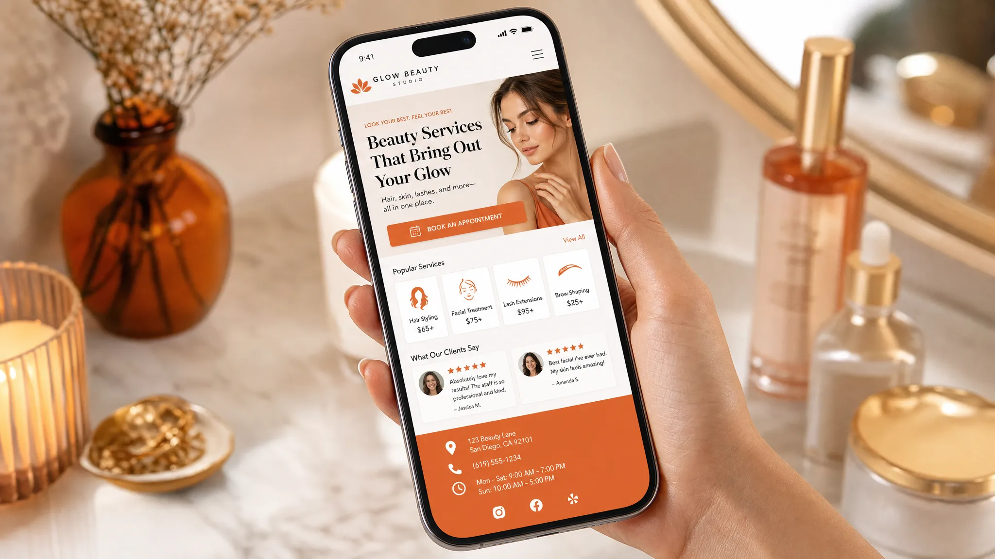
Put the most helpful information near the top
The top of the page has a real job. It should help someone understand what you do without scrolling for a long time.
That does not mean you need to squeeze everything into the first screen. It does mean the first section should be clear.
A strong first section usually includes:
- What you do
- Who it is for
- Where you are, if location matters
- One clear button
- A photo or visual that feels like your business
For example, a vague headline like Beautiful care for every body sounds warm, but it does not tell a new visitor what they can book.
A clearer version would be Custom facials and gentle waxing in Los Angeles, with a button that says Book a skin appointment.
People often scan pages instead of reading every word. Nielsen Norman Group has written for years about how people scan web pages, which is why headings, buttons, and early page sections matter so much. Your visitor may not read every paragraph, but they will notice the page order.
Use buttons like helpful signs
Buttons are not decoration. They are directions.
If every button says something different, visitors may wonder which one matters. If the main booking button is hidden in the menu, they may not see it at all, especially on a phone.
Use plain button text that says exactly what happens next. Book an appointment is clearer than get started. View services is clearer than explore. Ask about a private session is clearer than submit.
Good places for a booking button include the top section, after your service overview, near your trust-building section, after pricing or process details, and again near the bottom of the page.
This does not mean shouting at people every few lines. It means placing a clear sign at the moments when they are likely to be ready.
If you want a deeper look at arranging page sections around booking, this guide on website page layout tips for clearer paths to booking walks through that idea in more detail.
Keep each section focused on one job
A clear layout is made of small, focused sections. Each section should answer one main question.
Your service section explains what people can book. Your proof section helps people trust you. Your process section shows what happens before, during, or after the appointment. Your pricing section removes guesswork. Your frequently asked questions reduce back-and-forth messages.
When one section tries to do everything, it gets muddy. A long block about your story, services, policies, reviews, and booking link may feel efficient to you, but it can feel heavy to a new visitor.
Use headings that sound like what clients are looking for. Instead of Our offerings, try Services you can book. Instead of Experience the difference, try What to expect at your first visit.
Plain headings are not boring. They are kind to people who are trying to make a quick decision during a lunch break, between clients, or while sitting in their car before an appointment.
Design for the phone in their hand
Many local clients will visit your website from a phone. They may be looking you up after seeing your Instagram, checking your prices from Google Maps, or trying to book before they forget.
A mobile-friendly layout is not just a smaller desktop page. It should be easy to read and tap with one thumb.
On mobile, your layout needs short sections, large enough text, buttons with space around them, and the most important details before the visitor has to scroll too far. If your address, booking link, or service list is hard to find on a phone, people may give up even if they like your work.
This matters even more for businesses that get last-minute bookings or clients trying to fill slow weeks. If someone is ready to book a lash fill, facial, wax, massage, class, or training session, the page should not slow them down.
Add trust before asking people to book
A booking button works better when the visitor feels safe using it. This is especially true for personal services like waxing, skincare, lashes, nails, fitness, wellness, and bodywork.
Trust can come from simple details. Real photos of your space help people picture the visit. A short note about your experience can calm nerves. Reviews help new clients see that other people felt cared for. Clear policies can reduce no-shows and awkward surprises.
The key is to place trust close to the decision. If your reviews are buried at the very bottom, many visitors will never see them. If your policies are hidden on a separate page, clients may book without understanding your cancellation window or deposit rules.
Good layout brings the right proof to the right moment.
The same idea shows up outside websites too. A professional profile service with recruiter-led profile edits puts the most decision-making details where hiring teams can see them. Your website should do the same for future clients, with the strongest proof close to the place where they choose their next step.
A simple website layout for a local service business
You do not need a complicated structure to make a website feel clear. For many small businesses, this order works well for a homepage or one-page site.
| Page section | What it should do | What to include |
|---|---|---|
| Top section | Confirm the visitor is in the right place | Service, location, who you help, main booking button |
| Service overview | Show what can be booked | 3 to 6 core services with short descriptions |
| Why clients choose you | Build trust without overexplaining | Reviews, experience, approach, studio feel |
| Featured service or offer | Guide visitors toward a good first choice | New client facial, intro training session, first-time wax |
| Process | Reduce uncertainty | What happens before booking, at the visit, and after |
| Pricing or starting points | Help people decide | Starting prices, package notes, or consult options |
| Location and hours | Answer practical questions | Neighborhood, parking notes, hours, contact details |
| Final booking section | Make the next step easy | Book button, short reassurance, contact option |
This order can change depending on your business. A trainer may need more space for results and training style. A skincare studio may need more space for service education and first-visit expectations. A nail or lash salon may need policies, timing, and portfolio photos close to the service list.
The point is not to copy one perfect layout. The point is to put information in the order a real client needs it.
Use space to make the page feel calmer
Empty space is not wasted space. It helps people understand what belongs together.
If your website feels cramped, visitors may not know where to look. When every section has a different background, font size, button style, or color, the page can start to feel noisy. A calmer layout gives the eye a path.
Use enough space between sections so the page feels easy to skim. Keep related items together, like a service name, short description, price, and button. Do not make people jump around the page to connect basic details.
This is especially important for beauty and wellness businesses. Your website should feel like the experience you want clients to expect: clear, cared for, and easy to enter.
Avoid the layout mistakes that make visitors stall
Small layout problems can create big hesitation. Most of them are easy to miss when you have looked at your own site for months or years.
Common issues include:
- Starting with a large logo but no clear explanation of what you do
- Hiding booking links only in the menu
- Using cute service names without a plain explanation
- Putting prices, timing, or policies far away from service details
- Making every section compete for attention
- Using buttons that do not say what happens next
- Adding pop-ups before visitors understand the page
The goal is not to strip away personality. Your site can still feel warm, stylish, fun, soft, bold, or high-end. It just needs to be understandable first.
If someone has to text you to ask where to book, what service to choose, or where you are located, your layout may be making them work too hard.
Match the layout to the type of page
Not every page needs the same structure.
A homepage needs to help people choose a path. It may introduce your main services, show trust, share your location, and guide visitors toward booking or learning more.
A service page needs to help someone decide on one service. It should explain who the service is for, what is included, what it costs or where pricing starts, what to expect, and how to book.
A landing page is best when you have one clear offer, like a launch, limited-time package, event, waitlist, or signature service. If that sounds closer to what you need, a focused landing page design in Los Angeles may be simpler than a full site.
A full website makes sense when people need to compare several services, learn about your team, understand your process, read policies, or find you through Google for different searches.
For a broader look at service-based sites, these service website design tips cover more ways to help visitors move from looking around to feeling ready to book.
A quick self-check for your own website layout
Open your website on your phone and pretend you are a brand-new client. Better yet, ask a friend who does not know your business well.
Look for these answers within the first minute:
- Can I tell what this business does?
- Can I tell where it is located or who it serves?
- Can I find the service I want?
- Can I see proof that real clients trust this business?
- Can I understand pricing, timing, or what happens next?
- Can I book without hunting?
If the answer is no to more than one of these, you do not necessarily need a bigger website. You may just need a clearer layout.
Frequently asked questions
What is the first thing I should fix in my website layout? Start with the top of the page. Make sure it says what you do, who you help, where you are if location matters, and what the visitor should do next.
How many booking buttons should one page have? Use enough that people do not have to hunt. For many service pages, a button near the top, one after the service details, and one near the bottom feels natural.
Should my prices be near the top of the page? If price is an important part of the decision, make it easy to find. You can share starting prices, ranges, or a note that a consult is needed, depending on how your business works.
Can a one-page website be enough for a small local business? Yes, if the page clearly explains your services, trust points, location, and booking path. A full site may be better if you offer many services or want more pages for Google searches.
How do I know if my layout is confusing people? Watch for repeated questions in DMs, texts, or calls. If people keep asking where to book, what service to choose, how much it costs, or where you are located, the page may need a clearer path.
Make the next step easy to see
Your website does not need to be fancy to help people take action. It needs to feel clear, trustworthy, and easy to move through.
If you are a Los Angeles small business owner with a website that feels outdated, hard to use on mobile, or too confusing for clients to book, Raine Archer can help. I design booking pages, sales pages, and full sites for salons, solo pros, creators, and local service businesses, with warm design, copy support, light SEO setup, and care options after launch.
When you are ready for a site that guides people gently toward booking, you can work with Raine Archer.