What Great Service Website Design Needs to Convert
Learn what great service website design needs to turn visitors into booked clients, from messaging and mobile UX to trust, SEO, and CTAs.
Your service website has one job: help the right visitor feel confident enough to take the next step. That step might be booking an appointment, requesting a quote, joining a waitlist, buying a service package, or scheduling a consultation. Whatever the action is, great service website design removes uncertainty before it asks for commitment.
A lot of small business websites look polished but still underperform because they answer the wrong questions. Visitors are not only judging your colors, logo, or layout. They are quietly asking: Do you understand my problem? Can I trust you? Is this for me? What happens after I reach out? How much effort will this take?
Conversion-focused design is not about pushing people. It is about making the decision easier for the people who are already looking for what you offer.
Why service websites convert differently than product websites
Service businesses sell something less tangible than a product. A visitor cannot hold the result in their hand, compare specs, or check out in two clicks. They are often buying expertise, time, taste, care, judgment, or transformation.
That makes trust the core of service website design. A salon client wants to know whether their hair will be handled well. A solo consultant prospect wants to know whether the investment will be worth it. A creator launching an offer wants to know whether the page will explain the value clearly. In every case, the website has to reduce perceived risk.
A converting service website usually answers these questions quickly:
| Visitor question | What your website should provide |
|---|---|
| Is this service for someone like me? | Clear audience language, niche cues, and relevant examples |
| What outcome can I expect? | Specific benefits, transformation, or practical deliverables |
| Can I trust this person or business? | Testimonials, portfolio work, credentials, process, and real photos |
| What will it cost me in time, money, or effort? | Starting prices, timelines, expectations, and next steps |
| How do I take action? | Obvious calls to action, simple forms, and mobile-friendly booking |
If a page is beautiful but leaves these questions unanswered, visitors will often leave to keep researching.
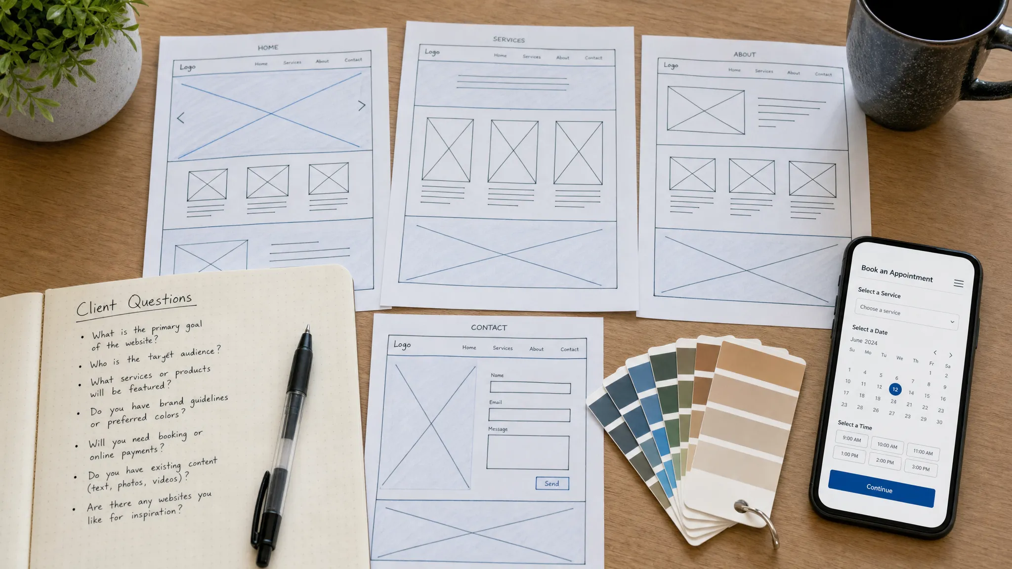
Start with one primary conversion goal
Before you choose fonts, colors, page sections, or animations, define the one action the page should support. A homepage can have supporting paths, but every key page should still have a primary goal.
For a service provider, that goal might be:
- Book an appointment
- Request a consultation
- Fill out an inquiry form
- Buy a service package
- Join a waitlist
- Download a lead magnet before a higher-ticket offer
The mistake is trying to make one page do everything with equal emphasis. When every button has the same visual weight, nothing feels important. When your navigation has ten competing options, visitors are more likely to browse than act.
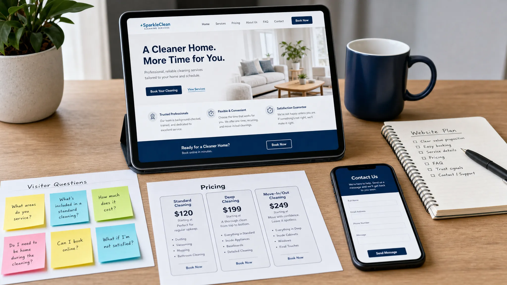
A strong service website guides the eye. The primary call to action should appear above the fold, repeat naturally after persuasive sections, and use language that matches the actual action. Book a brow appointment is clearer than Get started. Request a custom quote is clearer than Submit.
Make the first screen instantly clear
The top of the page should not make visitors decode what you do. This is especially important because people scan web pages before they read deeply. The Nielsen Norman Group has documented common scanning patterns, which is a useful reminder that your most important message needs to be easy to catch at a glance.
A strong first screen usually includes:
- A specific headline that says what you do and who you help
- A short supporting line that explains the outcome or difference
- One primary call to action
- A trust cue, such as years of experience, a location, a testimonial snippet, or a recognizable client type
- Visuals that support the service instead of filling space
For example, a vague headline like Elevated beauty experiences sounds polished, but it does not tell a visitor what to book. A clearer version might say Natural brow shaping and lash lifts for low-maintenance beauty in Los Angeles. The second version gives the service, audience, vibe, and location.
Clarity does not have to feel cold. Warm, human copy can still be specific. In fact, specific copy often feels more caring because visitors can immediately tell whether they are in the right place.
Package your services so people can self-qualify
Many service websites hide the practical details that buyers need most. They describe the philosophy, the passion, and the vibe, but not what is included or what happens next.
For conversion, your service pages should help visitors self-qualify. That does not mean every service needs a rigid package or exact public price. It does mean people should understand whether they are a good fit before they contact you.
| Service page element | Why it helps conversion | Example of what to include |
|---|---|---|
| Who it is for | Helps visitors recognize themselves | Best for first-time clients, growing teams, busy founders, bridal clients |
| What is included | Reduces uncertainty | Consultation, deliverables, revisions, prep guide, follow-up support |
| Starting price or range | Filters poor-fit inquiries | Starting at, packages from, custom quotes available |
| Timeline | Sets expectations | Typical turnaround, appointment length, booking window |
| Process | Makes the service feel safer | Inquiry, consultation, proposal, booking, delivery, follow-up |
This is where service website design overlaps with positioning. If visitors cannot understand your offer, the layout cannot save the page. The offer itself needs to be organized, named, and explained in plain language.
Build trust before asking for commitment
Trust is not one section called testimonials. It is the feeling created across the entire website.
For a service business, trust can come from several places: client results, before-and-after examples, a thoughtful process, clear policies, professional photography, helpful FAQs, strong copy, consistent branding, and a site that works smoothly on mobile.
The most persuasive trust elements are specific. A testimonial that says She was amazing is nice, but a testimonial that explains what changed is stronger. A portfolio image is helpful, but a short note about the client goal, challenge, and result gives the visitor more context.
Service businesses should also show signs of real operation. Include location details if relevant, business hours if people need them, updated service information, active booking links, and clear contact options. Outdated pages make visitors wonder whether the business is still active.
Do not fake urgency, inflate results, or overstate credentials. Conversion that depends on exaggeration creates the wrong kind of leads. The better goal is trust that continues after the first inquiry.
Design the path to booking like a concierge
A good booking path feels obvious, calm, and easy. Visitors should not have to hunt for a contact form, wonder whether the calendar is current, or guess what information to send.
Think of your booking flow as part of the service experience. If the first step feels confusing, visitors may assume the rest of the process will feel the same.
A form that converts well is usually:
- Short enough to complete without frustration
- Specific enough to help you qualify the lead
- Clearly labeled and accessible
- Paired with a note about response time or next steps
- Easy to use on a phone
Accessibility is part of conversion, not a bonus. For example, WebAIM recommends clear form labels so users understand what information belongs in each field. Good labels help people using assistive technology, and they also help busy mobile visitors complete the form without guessing.
After someone submits an inquiry, do not leave them in silence. A confirmation message or follow-up email should say what happens next. Even a simple note such as You will hear back within two business days can reduce anxiety.
Mobile-first design is no longer optional
For many local and service-based businesses, the first visit happens on a phone. Someone finds you through search, social media, a referral text, or a map result. If the mobile experience is hard to use, you may lose the lead before they ever see your full offer.
Google also uses mobile-first indexing for search, which means the mobile version of your site matters for visibility as well as usability. You can read Google’s guidance on mobile-first indexing for the technical details, but the practical takeaway is simple: your mobile site cannot be an afterthought.
Mobile-first service website design should prioritize readable text, fast-loading pages, tap-friendly buttons, simple navigation, and booking links that work without pinching or zooming. If you serve a local audience, make phone numbers, addresses, maps, and appointment buttons especially easy to access.
Good service website design also feels human
Conversion does not require sounding corporate. In many service industries, warmth is part of the sale. People want to know there is a real person or thoughtful team behind the page.
Human-centered design shows up in small details. Your copy can acknowledge common hesitations. Your photos can show your space, your process, or your face if that supports trust. Your microcopy can make forms feel less intimidating. Your About section can explain why you do the work, but it should still connect back to why that matters for the client.
The best tone depends on the business. A bridal makeup artist may need softness and reassurance. A strategist may need clarity and authority. A fitness coach may need energy and accountability. A strong website does not copy a trendy aesthetic. It translates the business experience into a digital first impression.
Use SEO to attract the right visitors, not everyone
SEO for service businesses should be focused. You are usually not trying to rank for every broad term in your category. You are trying to show up for the people most likely to book.
That means your pages should naturally include the words clients actually use when searching for your service. A local salon may need service plus city language. A consultant may need industry or outcome-based terms. A creator selling a workshop may need copy that explains the offer, audience, and transformation.
Good service SEO usually includes clear page titles, descriptive headings, internal links, optimized image alt text, helpful FAQs, and fast page performance. It also means avoiding keyword stuffing. Repeating service website design unnaturally twenty times will not make a weak page more useful. Search engines and human visitors both reward relevance, clarity, and usefulness.
SEO gets people to the page. Conversion gets them to act. The best websites treat both as part of the same job.
Know when you need a landing page, booking page, or full site
Not every service business needs the same website structure. The right format depends on the offer, the buying journey, and how much trust-building your visitor needs before taking action.
| Website format | Best for | Conversion focus |
|---|---|---|
| Booking page | Simple services, appointments, repeatable offers | Get visitors from interest to scheduled time quickly |
| Landing page | One launch, one offer, one campaign, or one clear service | Explain the offer and drive one focused action |
| Full website | Multiple services, local SEO, deeper trust-building, broader brand presence | Help visitors explore, compare, trust, and inquire |
If you are promoting one offer and do not need a multi-page site yet, a focused landing page design can be the cleaner choice. If you have multiple services, need a portfolio, want to rank locally, or need more trust-building content, a full site usually gives you more room to guide visitors.
A booking page can be enough when the service is easy to understand and the visitor already has intent. For example, a returning salon client does not need a long sales page to book a maintenance appointment. A new client considering a premium transformation may need more education, proof, and reassurance.
A practical conversion checklist for your service website
Use this checklist to review your current website or plan a new one. If any row feels weak, that area may be costing you inquiries.
| Area | What to check |
|---|---|
| Headline | Does it clearly say what you do, who you help, and why it matters? |
| Offer | Can visitors understand what is included and who it is for? |
| Pricing | Is there enough pricing context to qualify serious leads? |
| Proof | Are testimonials, examples, credentials, or results easy to find? |
| Process | Do visitors know what happens after they inquire or book? |
| CTA | Is the main action obvious on every key page? |
| Forms | Are forms short, labeled, mobile-friendly, and reassuring? |
| Mobile | Can someone read, navigate, and book comfortably on a phone? |
| SEO | Are pages named and structured around real services and search intent? |
| Maintenance | Are links, forms, plugins, service details, and policies kept up to date? |
The maintenance row is easy to overlook. A website that converts today can slowly lose performance if booking links break, service details change, pages slow down, or old promos stay live. For service businesses, ongoing care protects both trust and revenue.
Common service website mistakes that hurt conversions
One of the biggest mistakes is leading with aesthetics before strategy. A beautiful color palette cannot fix a vague offer. A trendy layout cannot replace a clear path to booking.
Another common mistake is writing from the business owner’s perspective instead of the client’s. Visitors care about your story, but they first need to know whether you can help them. Every section should connect back to their problem, desire, or decision.
Many service sites also bury the call to action. If the only booking button is in the navigation or at the very bottom of the page, mobile visitors may miss it. Repeat the CTA where it naturally fits, especially after sections that build understanding or trust.
Finally, some websites ask for too much commitment too soon. If your service is expensive, personal, or complex, visitors may need a consultation, guide, quiz, or inquiry step before booking. Match the CTA to the level of trust required.
Frequently Asked Questions
What is service website design? Service website design is the process of creating a website that explains a service, builds trust, and guides visitors toward an action such as booking, inquiring, or purchasing a package.
How many pages does a service business website need? It depends on the offer. A simple service may only need a booking page or landing page, while a business with multiple services, portfolio work, local SEO goals, and deeper trust-building needs may benefit from a full site.
Should a service website show pricing? In most cases, some pricing context helps conversion. You can show starting prices, package ranges, or explain that custom quotes are available. The goal is to help the right clients self-qualify before they inquire.
What makes a service website trustworthy? Trust comes from clear messaging, real proof, testimonials, process details, updated information, accessible design, strong mobile usability, and honest expectations about pricing, timelines, and next steps.
Can a beautiful website still fail to convert? Yes. A site can look great and still lose leads if the offer is unclear, the CTA is hidden, the mobile experience is frustrating, or visitors cannot find enough proof to feel confident.
Ready for a website that helps people book?
Great service website design is not about adding more sections. It is about removing doubt, guiding attention, and making the next step feel easy.
If your current site looks fine but does not bring in the right inquiries, it may need clearer messaging, a stronger booking path, better mobile flow, or a more focused page structure. Raine Archer designs warm, conversion-focused booking pages, sales pages, and full websites for small businesses, salons, solo pros, and creators. Explore Raine Archer’s website design services if you want a site that feels like you and helps visitors take action with confidence.